In 2008 I had just registered a company. It had a name and very little else. Maria and I were in Buenos Aires to learn the tango, which meant evenings of counting steps and long walks between lessons.
On one of those walks, I stopped in front of a wine poster. It held the emotions I had been gathering all through that trip to Argentina, and I wanted to know who had made it. The answer was Lucila Ruiz Moreno and Santiago Zemma. I wrote to them, and together we began work on a logo, a postcard and a business card.
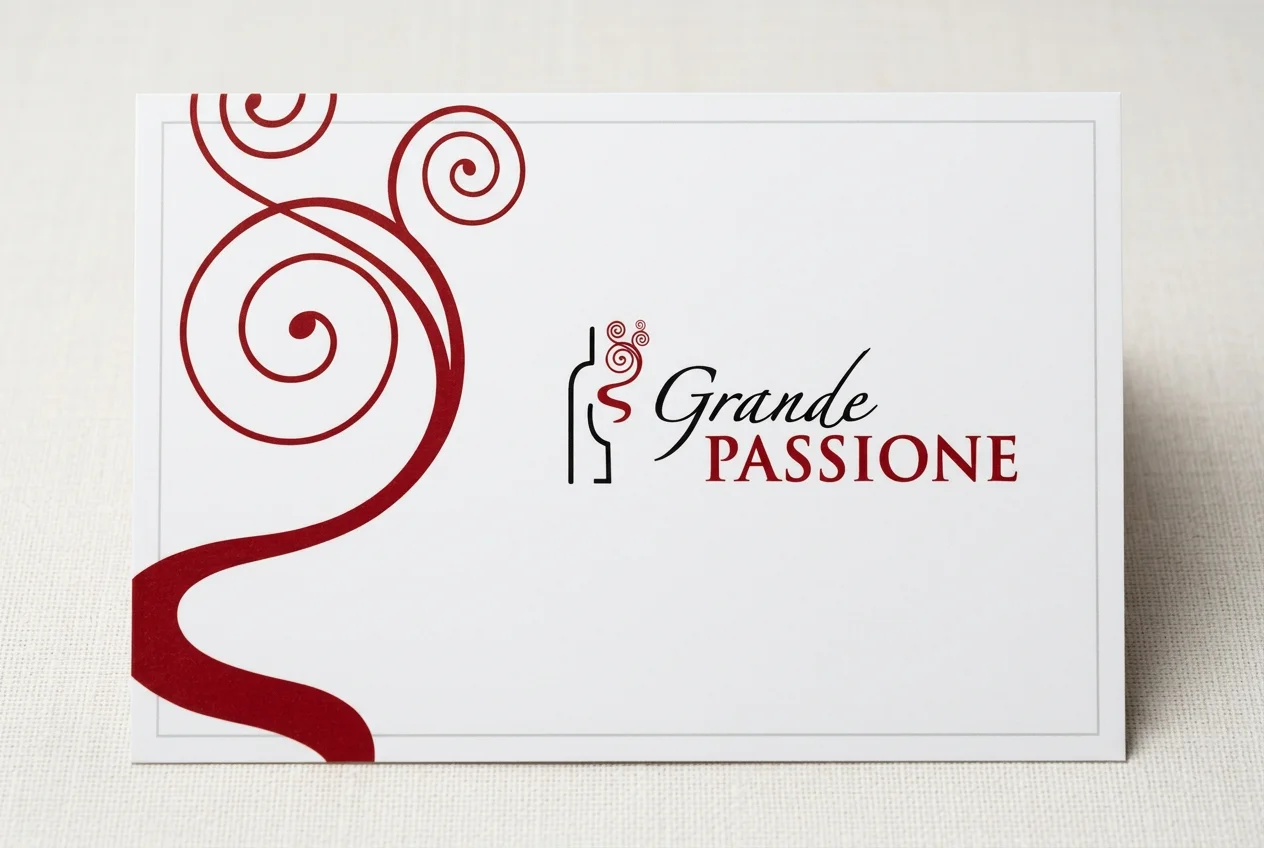
The postcard Lucila and Santiago designed for Grande Passione in 2008.
I chose that logo in an afternoon. It has worked for me every day since. For a wine producer, the same choice carries far higher stakes, because a label has to win a stranger at a shelf in a few seconds, bottle after bottle. In Italy, that choice is about to be tested harder than at any time in a generation.
One mark, four readings
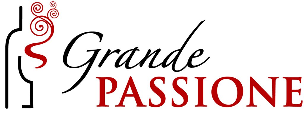
It is a simple mark. A bottle drawn in a single black line. From its neck a red S rises and unwinds into spirals. Beside it, Grande in a calligraphic hand; beneath, PASSIONE in firm red capitals.
We were living in Hong Kong then, and I asked friends what they saw. Those who knew little about wine saw a Chinese dragon. Many women saw a perfume, diabolically seductive. A friend studying wine saw a vine tendril. I saw, perhaps less romantically, the aromas of a mesmerising wine rising from the glass.
Lucila and Santiago had sent several proposals. I chose this one mostly for the icon, and over the years I have come to love the lettering as much. The calligraphic Grande has something ethereal about it, floating above the bolder, more intense PASSIONE. It expresses what I would later spend my days teaching: balance and harmony. Passion has its intense side. It also has something tender, delicate, perhaps even timid.
Why a symbol works on people
Wine is bought before it is tasted, so the label speaks first. At Geisenheim in Germany, 521 wine drinkers tasted wines blind, then again with the bottles in view. Packaging proved the largest single influence on how much they liked what was in the glass, at 46%, ahead of brand and of taste itself. Yet ask people directly and they will say the label hardly matters. Researchers in Australia found that consumers who rated packaging as unimportant gave it far more weight once they chose from a simulated shelf.
Something subtler happens with symbols. When the French researcher Franck Celhay showed Bordeaux-style labels to 932 consumers, the ideas each design called up were strikingly consistent across gender, generation and wine knowledge. Design is a shared language. My friends in Hong Kong, though, each saw something different in the same swirl.
Both hold. The code is shared: a bottle, a red line and a hand-drawn letter say wine, passion and craft to almost anyone. The detail is left open, and each person completes it with their own life. A dragon, a perfume, a tendril. What someone has completed for themselves, they keep. That is how a mark becomes a bond.
Épuré
Lucila and Santiago have designed wine labels for thirty-two years, for wineries in Argentina, Uruguay, Portugal, France, Spain and Armenia. In 2017 their bottle and case for Rutini's Antología Julio Le Parc, created with Yamil Le Parc, won silver at the Pentawards, the international competition for packaging design.
What drew me to them in 2008 is still there. I can only describe it with a French word: épuré. Everything is brought back to its essence, minimal and yet complete.
Two labels
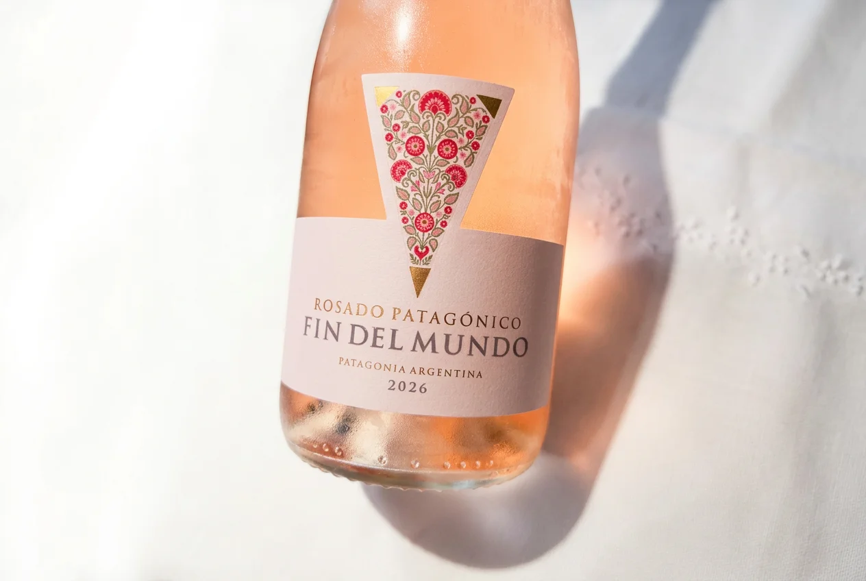
Fin del Mundo Rosado Patagónico. Design: Zemma & Ruiz Moreno.
Take their rosé for Bodega del Fin del Mundo, in Patagonia. A pale label. A narrow triangle descends from the neck, filled with small red and pink flowers, and ends in a gold point. I had guessed the triangle was the shape of Argentina, with Patagonia gilded at its tip. The designers' own note is simpler. The triangle is a symbol the winery has kept for more than twenty-five years. The flowers recall Patagonian species such as rosa mosqueta and oxalis. The whole was inspired by Tavel, the Rhône appellation that in 1936 became the first in France devoted entirely to rosé.
What moves me is how clearly it lets you feel the wine before you taste it: delicate, floral, complete. Its simplicity draws everyone. Researchers in Austria found the same thing at work in supermarket aisles, where red and orange on a label led shoppers to expect fruity, flowery wines. Look closely, and a small red heart sits at the root of the bouquet. Keep it in mind.
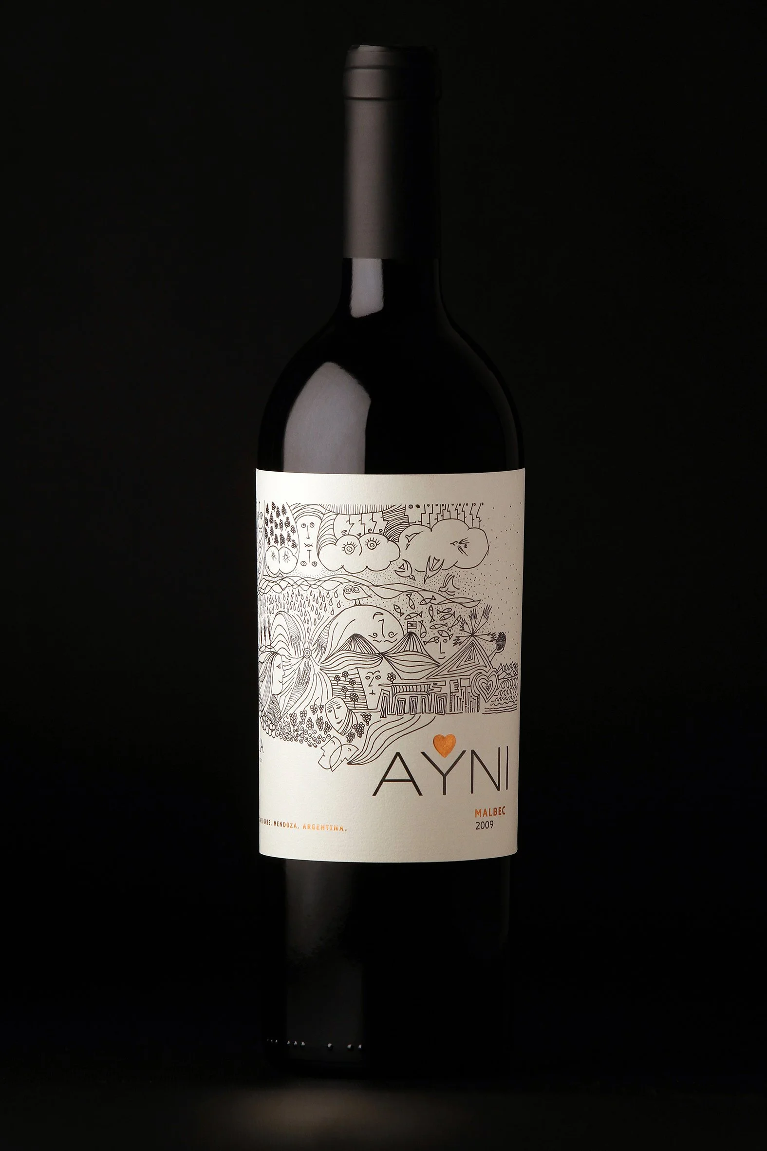
AYNI Malbec 2009, Chakana. Illustration: Santiago Zemma.
AYNI goes further. Santiago drew it by hand: one fine line wandering through mountains, rain, sun, faces, fish, vines and houses, until a small orange heart settles above the name. In the top corner, almost hidden, he signed it SZ.
Ayni is the Quechua and Aymara word for reciprocity, the principle by which Andean communities share work, food and care. The back label puts it in six words: para recibir, primero hay que dar. To receive, you first have to give. When the winery entrusted them with the name, Lucila told me, they loved the idea at once.
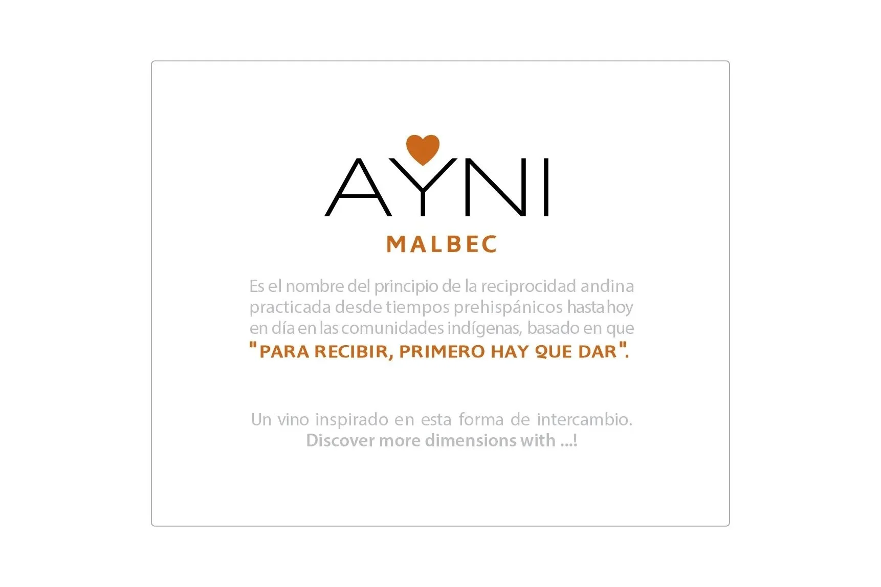
The AYNI back label.
I read that label as a promise between whoever made the wine and whoever opens it. It also says something about how good design comes about. The winery gave them a meaning worth drawing, and they returned it as an image people remember.
A word to Italian producers
Italian wine is entering a hard season. By May 2026, Unione Italiana Vini counted more than 53 million hectolitres of wine and must in Italian cellars, roughly a whole harvest unsold. To move stock, wineries are stepping wines down, from DOCG to DOC, DOC to IGT, IGT to table wine, at a cost UIV puts at €516 million in lost value. Italy is also the only major producing country to have expanded its vineyard area over the past five years. I expect many retirements and much consolidation ahead.
In that market, the wines that keep their price will be the ones people recognise, trust and choose again. Many good Italian wines deserve labels that say more about them. Treat design as you treat the vineyard and the cellar, as an investment, because it is the part of the wine every buyer meets first.
The research offers producers three lessons. First, judge a label by what buyers do at the shelf. Asked directly, they say design matters little; faced with a shelf, they let it guide their hand. Second, design carries price: in a study of Italian reds sold in China, a DOC or DOCG on the label and a clean, distinctive design both earned a premium, while warm-coloured labels sold at a discount. Third, be bold with care. When the purchase matters, a gift or a dinner, buyers prefer labels that respect the codes of their category, and labels built on humour lower perceived quality and willingness to pay.
So look for designers whose work already carries the emotion you want your wine to give, as I found on a street in Buenos Aires. Tell them what the wine means to you, then trust their eye. The task is to say who you are in a language anyone can read, and to leave a little room for the buyer to finish the thought.
Nearly two decades on
The swirl still rises: a bottle, a breath of red and a name spoken in two voices. Two designers I had not yet met gave me a mark I could grow into. I met Santiago a few years later, on another trip to Buenos Aires, in a room lined with books and bottles.
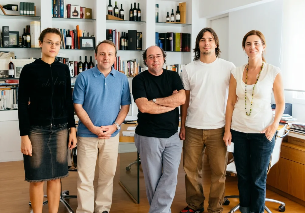
With Santiago Zemma and the studio team in Buenos Aires in February 2008.
When I wrote to tell them about this article, Lucila and Santiago replied with a warmth that moved me. This article is a small return on a gift made nearly two decades ago.
As Italian estates change hands over the coming years, the ones that endure will be those that entrusted their image to the right people and gave them time to do it well.
Sources
Mueller & Szolnoki (2010), Food Quality and Preference: summary; figures
Mueller, Lockshin & Louviere (2010), Marketing Letters
Celhay & Remaud (2018), Food Quality and Preference; Celhay & Passebois (2011), International Journal of Wine Business Research
Lick et al. (2017), Journal of Retailing and Consumer Services
Galati et al. (2018), Journal of International Food & Agribusiness Marketing
Lunardo & Rickard (2020), British Food Journal
Rutini Wines, Antología Julio Le Parc
Unione Italiana Vini figures, Vinetur, 8 July 2026
Tavel AOC, Inter Rhône
Ayni, Wikipedia